Real Madrid logo: How emblem represents the clubs royal heritage, legacy
The Real Madrid logo is an iconic emblem in the world of football, representing one of the most successful and prestigious clubs in history. With its regal crown, intertwined letters and bold colours, the logo is rich with symbolism and history. Each element of the design tells a story, reflecting the club’s royal heritage, its unwavering unity, and its commitment to excellence.
But what makes this logo so unique? Here is all we know.
Table of Content hide 1 What is Real Madrid logo? 2 Real Madrid logo meaning 2.1 The Crown 2.2 The Letters “MCF” 2.3 The Circle 2.4 The Blue Stripe 2.5 The White Background 3 Colours used for the logo 4 Real Madrid logo origin 4.1 The first logo (1902-1908) 4.2 A new look (1908-1920) 4.3 Royal recognition (1920-1931) 4.4 Changing colours (1931-1941) 4.5 The crown returns (1941-1997) 4.6 Modern updates (1997-present) 4.7 The current logoWhat is Real Madrid logo?

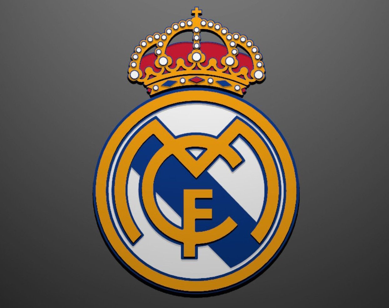
The Real Madrid logo is a symbol that represents the famous Spanish football club, Real Madrid. The logo has a circular shape and contains several elements that make it unique and recognisable.
At the centre of the logo, there is a big letter “M” that stands for Madrid. The “M” is part of a larger arrangement of letters that also includes “C” and “F”, which stand for “Club de Fútbol”. These letters are intertwined and displayed in a fancy, elegant style, showing the club’s rich history and tradition.
Surrounding the letters is a wide, circular band that forms the outer edge of the logo. This band is usually coloured in gold, adding a sense of prestige and honour. Within this band, the club’s full name, “Real Madrid Club de Fútbol,” is often written.
A large, bright crown sits on top of the circular logo. This crown symbolises the royal patronage given to the club by King Alfonso XIII in 1920. The crown is decorated with red and blue jewels and a cross on top, making it look very regal.
The colours used in the logo are significant as well. The main colours are white and blue, with gold and red accents. The white and blue represent the club’s traditional kit colours, while the gold and red add a touch of elegance and importance.
ALSO READ: Phillies logo: Understanding history, symbolism of Philadelphia’s beloved baseball emblem
Real Madrid logo meaning

The Real Madrid logo is more than just a design; it is filled with meaning, significance, and rich symbolism. Each element of the logo tells a story and represents important aspects of the club’s identity and history.
The Crown

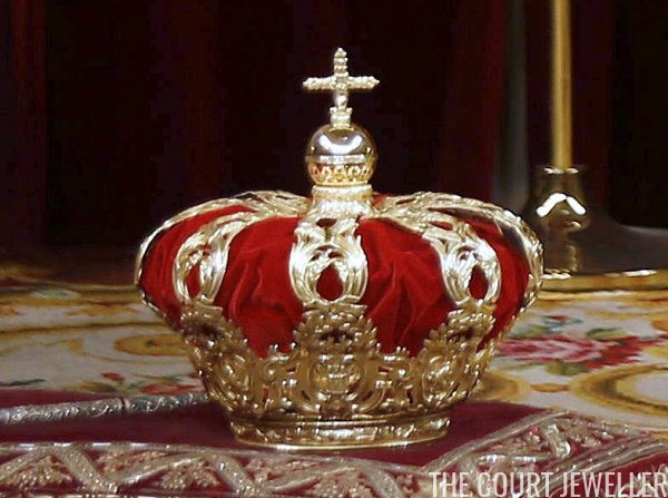
One of the most striking features of the Real Madrid logo is the crown on top. This crown was added in 1920 when King Alfonso XIII of Spain granted the club the title “Real”, which means “Royal”. The crown symbolises the club’s royal status and its close connection to the Spanish monarchy. The detailed crown, with its red and blue jewels, signifies prestige, honour and excellence. It is a reminder of the club’s elevated status and its commitment to achieving the highest standards in football.
The Letters “MCF”
The letters “MCF” in the centre of the logo stand for “Madrid Club de Fútbol”, which translates to “Madrid Football Club.” These letters are a direct reference to the club’s original name. They serve as a nod to the club’s origins and its long-standing tradition. The bold and intertwined design of the letters represents unity and strength, indicating how the club’s members and fans come together as one.

The Circle
The circle surrounding the letters “MCF” adds a sense of wholeness and continuity to the logo. Circles are often symbols of unity, eternity and protection. In the context of the Real Madrid logo, the circle signifies the club’s unbroken history and its enduring legacy. It represents the idea that Real Madrid is a complete and unified team, both on and off the field.
The Blue Stripe
The blue stripe running diagonally across the logo has a special significance. Originally added in 1931 and later changed to a plum purple before returning to blue, this stripe stands for the club’s distinct identity. Blue is a colour often associated with depth, stability and trust. The blue stripe symbolises the club’s reliable and steadfast nature, its calm under pressure and its deep connection with its fans. The stripe also adds a dynamic element to the design, suggesting movement and progress.
The White Background
The white background of the logo represents purity, simplicity and integrity. White is a colour that is often linked to cleanliness and fairness. For Real Madrid, the white background signifies the club’s commitment to playing fair and maintaining high ethical standards. It also highlights the elegance and simplicity of the design, making the other elements stand out more vividly.
ALSO READ: Mercedes logo: Story behind the three-pointed star
Colours used for the logo
The colours in the Real Madrid logo —gold, blue, red, and white— each carry their meanings.
- Gold: The gold in the crown symbolises wealth, success and high quality. It reflects the club’s numerous achievements and its high standards.
- Blue: The blue in the letters and the stripe stands for trust, loyalty and stability. It reflects the club’s reliable performance and the loyalty of its fans.
- Red: The red jewels in the crown signify passion, energy and strength. The colour reflects the intense passion that the club, its players, and its fans have for the game.
- White: The white background symbolises purity and integrity, representing the club’s commitment to fairness and high moral standards.
Real Madrid logo origin

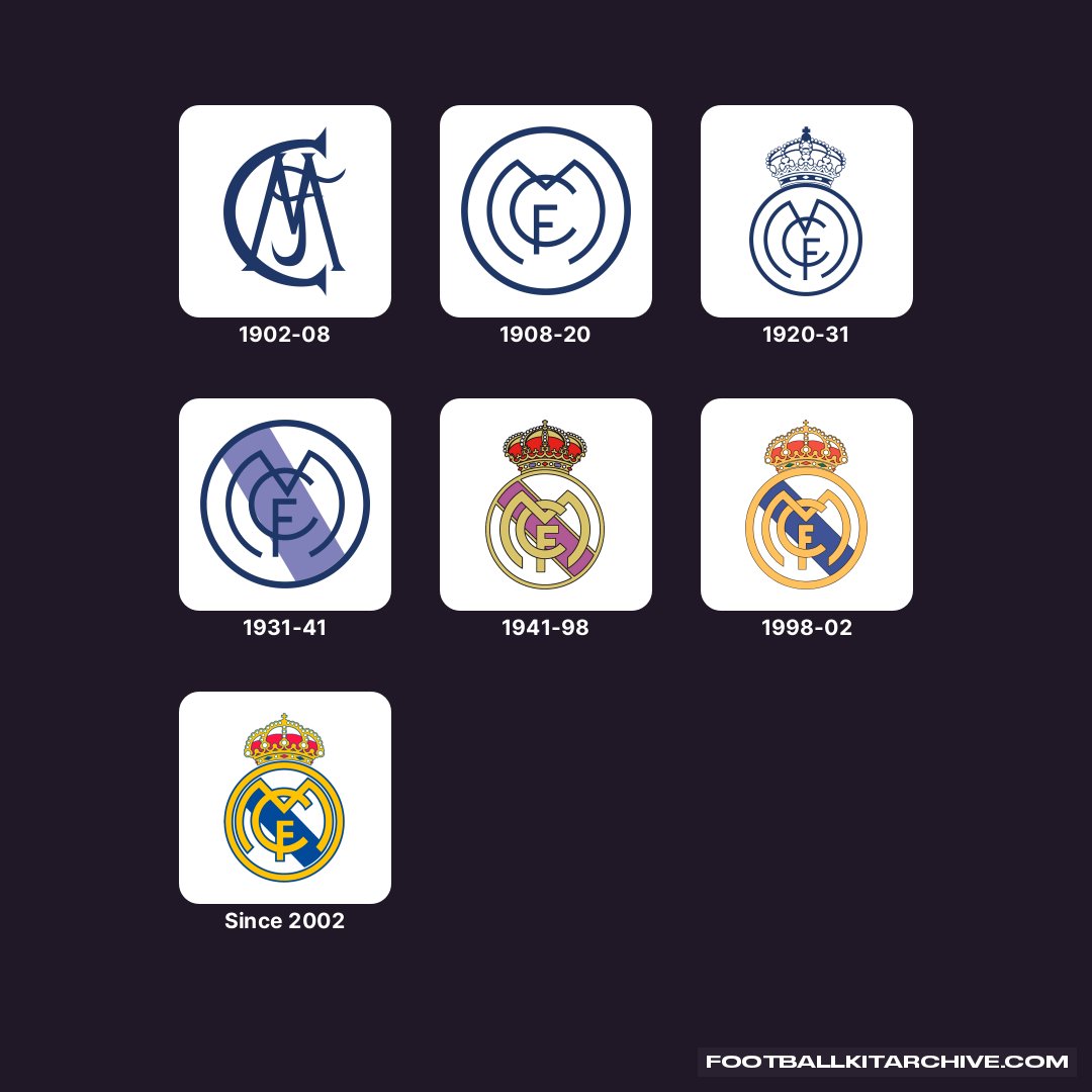
The story of the Real Madrid logo began over a century ago in Madrid, Spain. It all started in 1902 when a group of football enthusiasts founded a club they called Madrid Football Club. The founders wanted a symbol to represent their new team, so they created the first version of the logo.
The first logo (1902-1908)
The original logo was simple but strong. It featured a large white letter “C” intertwined with a smaller blue letter “M” and an even smaller “F” in the centre. These letters stood for “Madrid Club de Fútbol”. The letters were dark blue, placed on a clean white background, making the logo easy to recognise.
A new look (1908-1920)
In 1908, the logo underwent its first major change. The designers added a dark blue circle around the letters “MCF”, giving it a more complete and polished look. This design helped the logo stand out more and gave it a sense of unity and balance.
Royal recognition (1920-1931)
In 1920, an important event changed the logo’s appearance significantly. King Alfonso XIII of Spain granted the club the title “Real”, which means “Royal” in Spanish. To symbolize this royal honour, a golden crown was added on top of the logo. This crown featured red and blue jewels, and it became a symbol of the club’s royal status and prestige.
Changing colours (1931-1941)
The 1931 version of the logo introduced a new colour: Plum purple. The stripe down the middle of the circle, which was previously blue, became purple. The crown was removed due to political changes in Spain, and the logo became simpler.
The crown returns (1941-1997)
In 1941, the crown made its return to the logo, this time with more detail and a 3D effect. Small diamonds and additional colours were added to the crown, making it more vibrant. The plum-purple stripe remained, giving the logo a unique and distinguished look.
Modern updates (1997-present)
The logo saw another update in 1997, making the design cleaner and more modern. The crown remained but was simplified with fewer colours. The stripe down the middle returned to blue. This version was more streamlined and easier to recognize.
The current logo
Today, the Real Madrid logo still features the golden crown on top, the bold blue letters “MCF” in the centre, and a blue stripe running diagonally across the circle. This modern version blends elements from the club’s long history, creating a symbol that is both traditional and contemporary.
ALSO READ: Gamma symbol: Practical character utilised across diverse disciplines daily
ncG1vNJzZmivp6x7tLfAm5isoF6YvK570Z6YpWWdlrGztcNmo6ifn2Q%3D